
If you’re designing signs and graphics that identify a room or space in hotels, restaurants, offices, schools and other buildings, there are strict ADA (Americans with Disabilities Act) rules and regulations to ensure correct building compliancy.
Strict regulation means that designers cannot merely estimate the size of the domes (dots) on Braille or guess the correct spaces between lettering and images. The rules have been introduced to ensure that people with disabilities have a consistent and easy-to-follow experience when navigating buildings.
To help you create an ADA compliant sign design, we’ve produced the following guide to take you through the basics of ADA signage, including an overview on prepping your file for print in Adobe Illustrator (AI) software.

Important Rules for ADA Signage
Based on the 2010 ADA Standards for Accessible Design document, here is a quick overview of essential ADA sign regulations to be aware of before starting your ADA signage.
1. ADA signs are required for both public access and employee areas and should be designed with contrasting colors and with a non-glare finish.
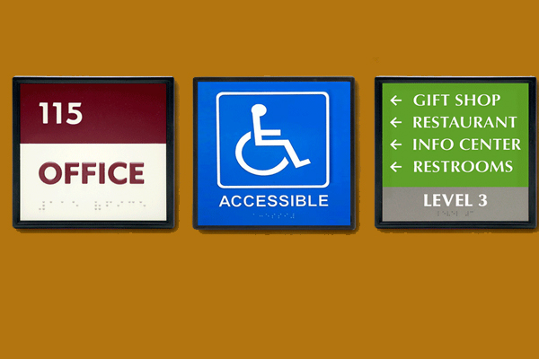
2. Signs that identify a room, space or area need to have raised characters and Grade 2 Braille— rather than a “letter-for-letter” translation, Grade 2 Braille is designed to read as complete, integrated words.

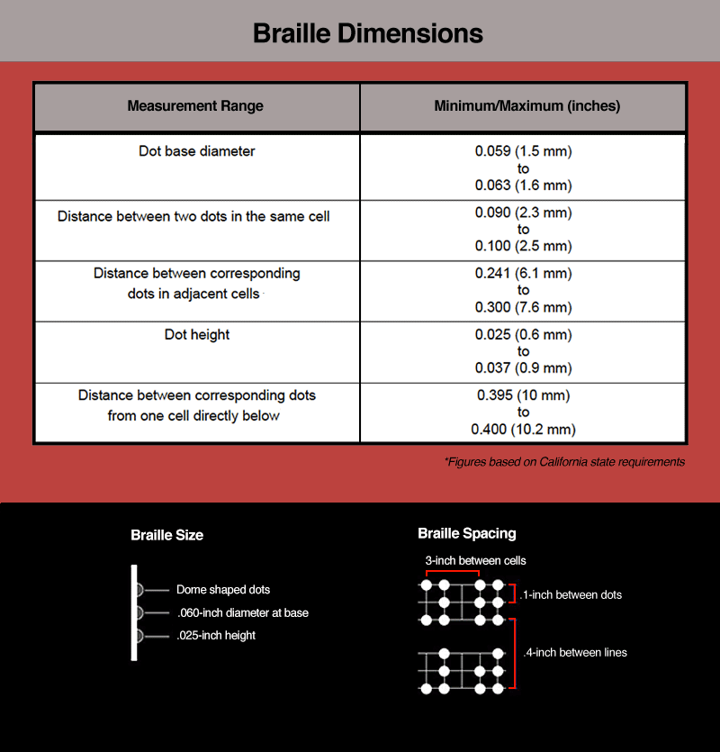
3. Braille sizing and spacing standards are strict in some states, such as California, having very exacting standards.
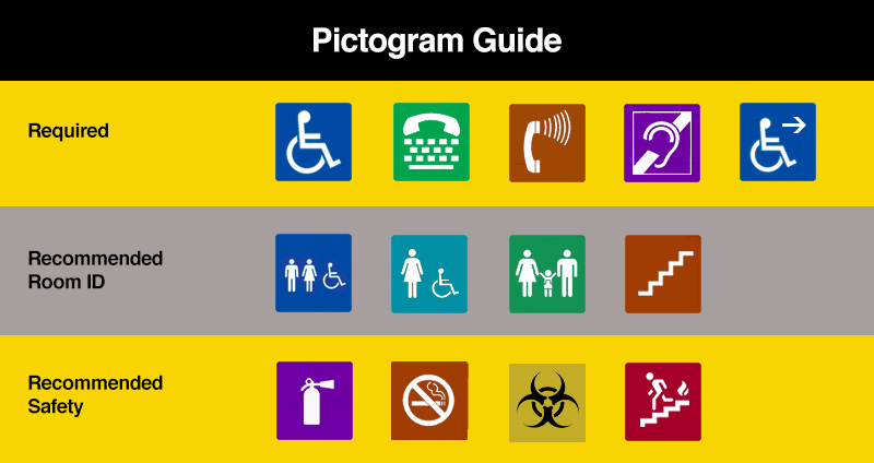
4. Signs should have the relevant ISA symbol (wheelchair symbol) where applicable and the use of other pictograms (i.e., symbols for restrooms, stair accessibility, etc.) is often a sign requirement.
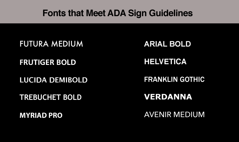
5. Text characters must all be uppercase and in a clearly definable sans serif font— not too bold, no italic, no condensed, etc.

Design Spacing and Layout on an ADA Compliant Sign
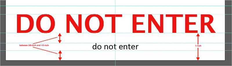
The following image illustrates important elements of an ADA compliant sign design with specific sizes and measurements between design fields that need to be adhered to, to ensure ADA compliance.


Designing Files in Adobe Illustrator for ADA Signage
For best results, prepare your ADA signs in Adobe Illustrator (AI) for output to VersaWorks or other RIP software. The following step-by-step instructions illustrate a typical ADA sign set-up.
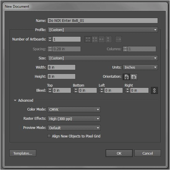
1. Create a new 8 x 8-inch document (CMYK/300ppi).
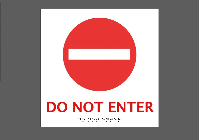
2. Add text to be converted into Braille. Align the text at the foot of sign, at least 3/8-inch above the bottom of the artboard/graphic.
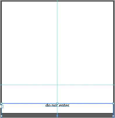
3. Add what will become your non-Braille text element 3/8-inch to 1/2-inch above the initial text layer and at-least 1-inch from the bottom of the artboard.
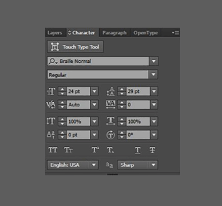
4. Highlight your Braille text element and change the font to Braille Normal or other commonly used Braille font.
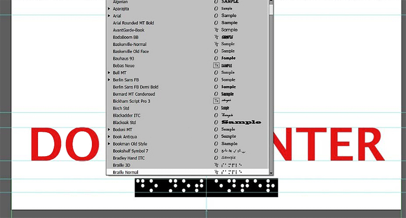
5. The font size should be 24pt with font leading of 29pt to keep the Braille spacing compliant (see comment below about translation software required).
|
Important Note:
Text on signs must be accompanied by Grade 2 Braille. Grade 2 is not a “letter-for-letter” translation of the text; it contains 265 contractions that represent whole words or groups
of letters. Accurate translation software is required to check the validity of Braille text.
|
6. Add desired graphic or pictogram. Graphics should occupy the top 6-inches
of the graphic.
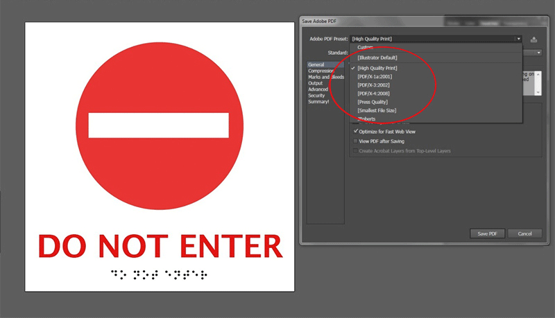
7. Save file as a “High Quality Print” PDF.
- VersaUV owners can download the full design document with instructions on setting up files for ADA compliant sign customization with LEF2-300 and LEF2-200 printers as well as large format UV customization with the LEJ-640FT.
Content Courtesy : Roland DGA